With Meta’s Quest Pro and other business-focused headsets arriving soon, we wondered what the world might look like for Shopify merchants in 3 to 5 years as productivity ecosystems develop.
Virtual photography in particular is a powerful new tool. Using 3D rendering to create ideal images is growing in popularity, but designing 3D sets on 2D screens requires more tutorials and merchant training than simply giving them intuitive spatial tools to achieve their goals.
With AR moving from phones to headsets, which are hands-free, a whole new world of content creation in 3D space with natural hand interactions is unlocked, so we decided to explore what it could look like to edit a product image with a spatial user interface.
Exploration
We started by studying and playing with the many features of the Oculus Interaction SDK.
We came away with better intuitions about natural interactions within VR today:
- Passive haptics are great - back interactables with real surfaces whenever you can (e.g. buttons that can be pressed until fingers touch a solid surface, or levers that can be used with an elbow resting on a solid surface).
- Tabletop-scale interactions - try to require as little physical exertion as possible.
- Avoid depending on gesture recognition too much - sometimes gestures are not detected, other times they are detected when they shouldn’t be, and if you have many of them in your workflow they can be difficult to remember.
We found that there’s a surprising amount of wisdom already captured in the Interaction SDK’s primitives, and that we could do fairly powerful things with them right out of the gate.
We played with different skeuomorphic metaphors for our camera, first exploring a Polaroid camera. Users would need to use a two-handed framing gesture to summon the camera, and then they could hold it and press the shutter button with their index finger as if they were using a real camera. The camera would then spit out a Polaroid photo every time you took a picture, and each photo could be resized by holding it with two hands.
We liked how intuitive this approach was, but the camera felt imprecise. The screen on its back was small, and it littered the scene by leaving many Polaroid photos floating around, so we decided to try a different approach.
The next skeuomorphic metaphor we tried was a video camera with a separate screen, which instantly solved the imprecision and litter problems. All users needed to do was pinch the camera to grab it, and as they moved it around the media on the screen would update in real time.
We really felt like this was something big to discover too: it wasn’t that skeuomorphism itself was good or bad, it’s choosing the right kind of metaphor to use in a situation. You’re designing both the UX of the objects and also the entire world at the same time - when you can make and do anything, it becomes increasingly important to do the right things.
This is slightly different from 2D web or mobile UX design, where often the patterns and environment are standardized and baked into the medium. You don’t really fiddle with the entire universe with the same freedoms (for better and worse).
Speaking of UX: we began with “always on” controls for lights and other studio elements, but the visual clutter quickly became overwhelming. We prototyped and built out a proximity reveal to help reduce visual noise while maintaining accessibility.
We also thought: why are controls a metaphor at all? What does a knob or dial do when you can do extra-physical virtual actions directly on models and interactable objects?
So we immediately loved this reach-into-the-photo-to-edit-it idea: if an image is a render that we make, why isn’t every “still” actually secretly a little portal to itself such that reaching into it, making a tweak, and then pulling back out commits the change?
Way easier than an entire whole extra studio with a separate camera and everything, right? We were thinking too physically, too stuck in the times of taking a photo and uploading a JPG to a Shopify product page and then hitting ‘save’ and all that. This is AR! We own the rules of the universe!
… we did not own the rules of the universe.
It turned out to be a pretty limiting pattern.
The real reason to have a whole seemingly-redundant set of UI for the camera, lights, environment, model, etc. is that there is just so much of it. How do you fit it all into a tiny frame? Our example above rotates the shoe, and that worked great for already set up scenes that were basically done, but it offered very little creative control for building up scenes from scratch or giving any meaningful deeper choices or creative direction. You just couldn’t really interact with anything else.

There might still be something to this idea, where moving into the picture frame expands it into your whole view such that you sort of teleport into the photo entirely (and then get a whole new room-space studio view to work with) instead of reaching into a small shoebox of the frame, but that might have to be explored in a future project.
Final prototype
The video below presents our vision of what editing a product image with a spatial user interface could look like in the future:
There is a lot to unpack here, so let’s talk about it.
We start off with a merchant at their kitchen counter launching their AR Shopify admin workspace.
On their left is a dashboard that shows them information about their Shopify store at a glance. Things like how many sales they have made that day, and what their revenue has been for the past month and year.
The dashboard also includes a 3D globe that shows orders in real time. The merchant can spin the globe as if it were real. This physicality is something that we particularly love about spatial user interfaces. A clock no longer has to be a number on a screen, for example. It can be a 3D object that the user can grab and interact with. 3D widgets can be truly delightful when used sparingly and appropriately.
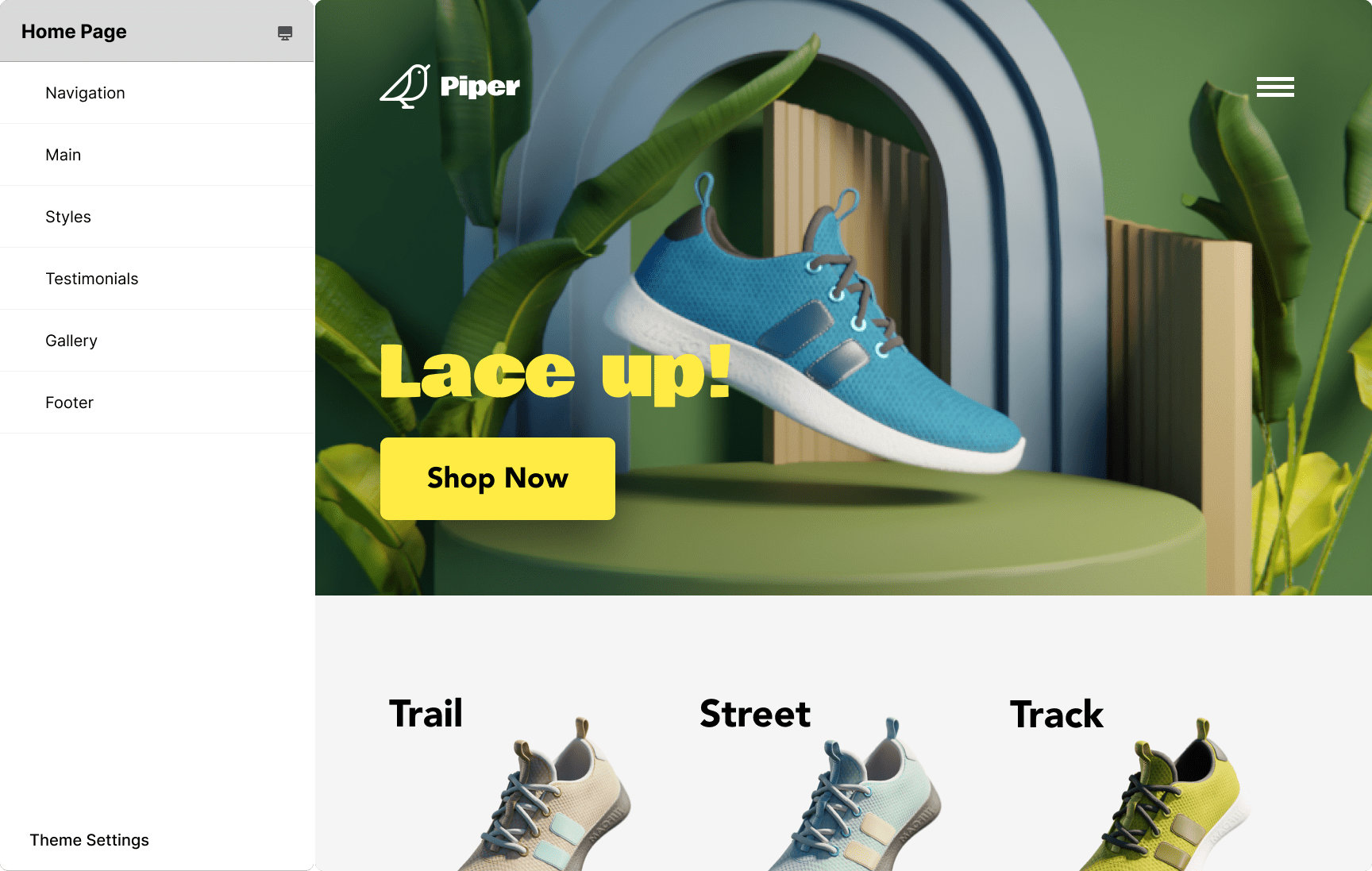
In front of the merchant is their Shopify admin page. They click on the customize button with their index finger, and that brings up a preview of their shoe store.

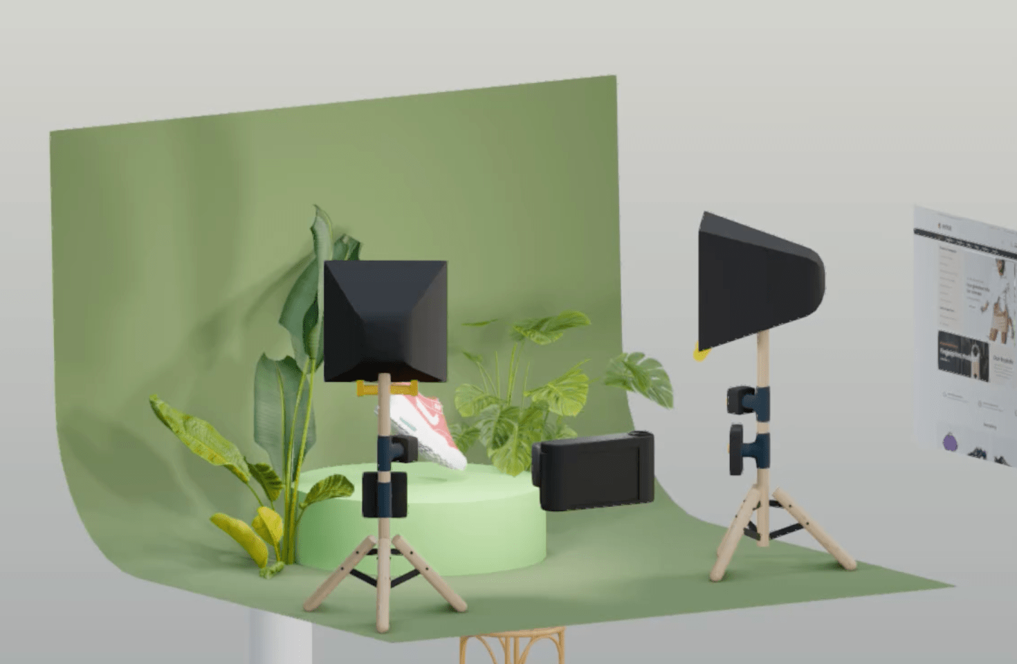
The merchant wants to improve the main image of the landing page, so they click on it and that brings up a tabletop virtual photography studio.
The shoe in the studio is a 3D replica of the real shoe that the merchant uploaded to their store. All the other 3D models are props from a large library that Shopify provides. They can be replaced to take photos of the shoe on a beach, for example, or in outer space.
The merchant decides that they want to highlight a different colorway of their flagship product, so they click on the shoe and that brings up a carousel containing all the options. The carousel is controlled with a slider that’s backed by the hard surface of the kitchen counter.
With the colorway selected, the merchant grabs the shoe and adjusts its orientation. They can also make it smaller or bigger by grabbing it with two hands and moving their hands closer or further apart. They can even rotate it by grabbing the pedestal on which it sits, which acts like a turntable.
Next, they adjust the lighting and framing using the light and camera widgets, whose controls are revealed when the hands of the merchant get close to them. A live preview of the final image on the merchant’s website allows them to get the image to look just right.
Finally, the merchant summons a “Go Live” button using a thumbs-up gesture. The button commits the changes and creates a celebratory moment for the merchant with some confetti fountains.
The whole experience is engaging and delightful.
Editor’s addendum (December 2022)
It’s funny to look back even a few months ago. We went from the black and white passthrough of the Quest 2 to the color passthrough of the Quest Pro, and we have since worked on a few projects with the new headsets.
It looks and feels so immediately antiquated to see these videos again. The last tweet in the original thread ends with this color-passthrough tease which we went through whole hoops to even make (using external hardware - the Zed Mini, which tapes to the front of the headset) and you can see the hand-hand tracking disparity, etc. but this was pretty cool back then. We wanted to show the future of where this stuff was going eventually.
Again: “back then” was a whopping 6 months ago.
The other big shift that happened within that precious time is the whole Stable Diffusion/AI art generation boom, which we pivoted to immediately after presenting this idea that manually making 3D models and setting up your own lighting and scenes would be important. Now you just grab any mediocre photo, train a whole model around it, and spit out amazing faux-tography.
We’re super excited to see what the next 6 months brings, and the six after that. It all moves so fast.

