Customization Options
To customize your component, you can create an options object in your configuration object. Each component you wish to customize (for example, product or cart), will have its own configuration nested within the options object. For example, to customize the product and the cart in a product component, you would pass through both cart and product objects:
ui.createComponent('product', {
  id: 1234567,
  options: {
    product: {
      buttonDestination: 'modal'
    },
    cart: {
      startOpen: true
    }
  }
});
Available keys in options object:
options = {
  product: {},
  cart: {},
  modal: {}, // configure the modal created by a product embed
  productSet: {}, // configure a collection or set of products
  toggle: {}, // configure the tab that toggles the cart open
  modalProduct: {}, // configure the product within the modal
  option: {}, // configure the variant option selectors within a product
  lineItem: {}, // configure the individual line items within a cart
}
Attributes for all components
The following attributes are configurable on any of the above objects.
iframe
Whether to render the component inside an iframe. Iframes are beneficial for most users because they isolate the embed in a “sandbox” so that other parts of your website don’t interact with it in unwanted ways. If you wish to have full control over the appearance of your embed and know how to use CSS, you may choose to change this value to false. If you do so, your components will appear unstyled.
Type: Boolean (true or false)
Default value: true for all top-level components, false for all nested components (ex. the product within a collection).
order
Order in which to render the elements within the component. You must list all elements you wish to include.
Example:
var order = [
  'title',
  'variantTitle',
  'price',
  'options',
  'description',
  'quantity',
  'button',
  'img',
]
Type: Array
Default value: dependent on component. View default values for all components
contents
Whether or not to render each element within the component. There is a key for each element in the object, set to either true or false by default. You may override any of these values.
Example:
var contents = {
  img: false
}
Type: object Default value: dependent on component. View component defaults
text
Values for all text visible in embeds except for that defined in the product itself (for example, you cannot change the title of a product from the text object, you would change that from your Shopify admin).
Example
var text = {
  button: 'Buy Now!'
}
Type: object
Default value: dependent on component. View component defaults
styles
Any custom styles for a component. Format is based on CSS. The styles object is nested, with top-level keys representing elements within the component that can be styled. The styles for each element are a set of key-value pairs, with each key being a valid CSS property. To style pseudo-selectors (ex: hover states), create another nested object with the key matching your pseudo-selector.
var styles = {
  button: {
    'color': 'red',
    ':hover': {
      'color': 'orange'
    }
  }
}
Type: object
Default value: dependent on component. View component defaults
events
A number of component lifecycle hooks are available for running custom functions.
These events can be used for custom functionality such as tracking, or advanced DOM manipulation. The following events are exposed on all components, several components additionally support component-specific events.
The value for each event key must be a function, which will be called with one argument, which is the instance of the component.
Note that the below hooks exist for all components except modalProduct and lineItem.
var events = {
  'beforeInit': function (component) {}, // before component is initialized
  'afterInit': function (component) {},
  'beforeRender': function (component) {}, // before component is rendered, after it has a `model` defined
  'afterRender': function (component) {},
  'beforeDelegateEvents': function (component) {}, // before events are bound to the DOM
  'afterDelegateEvents': function(component) {},
  'beforeUpdateConfig': function(component) {}, // before configuration is updated (only relevant in uncommon customizations)
  'afterUpdateConfig': function(component) {},
}
Attributes for specific components
Your embed creates several different types of component. The attributes you can configure on each depend on the component.
Component breakdown:
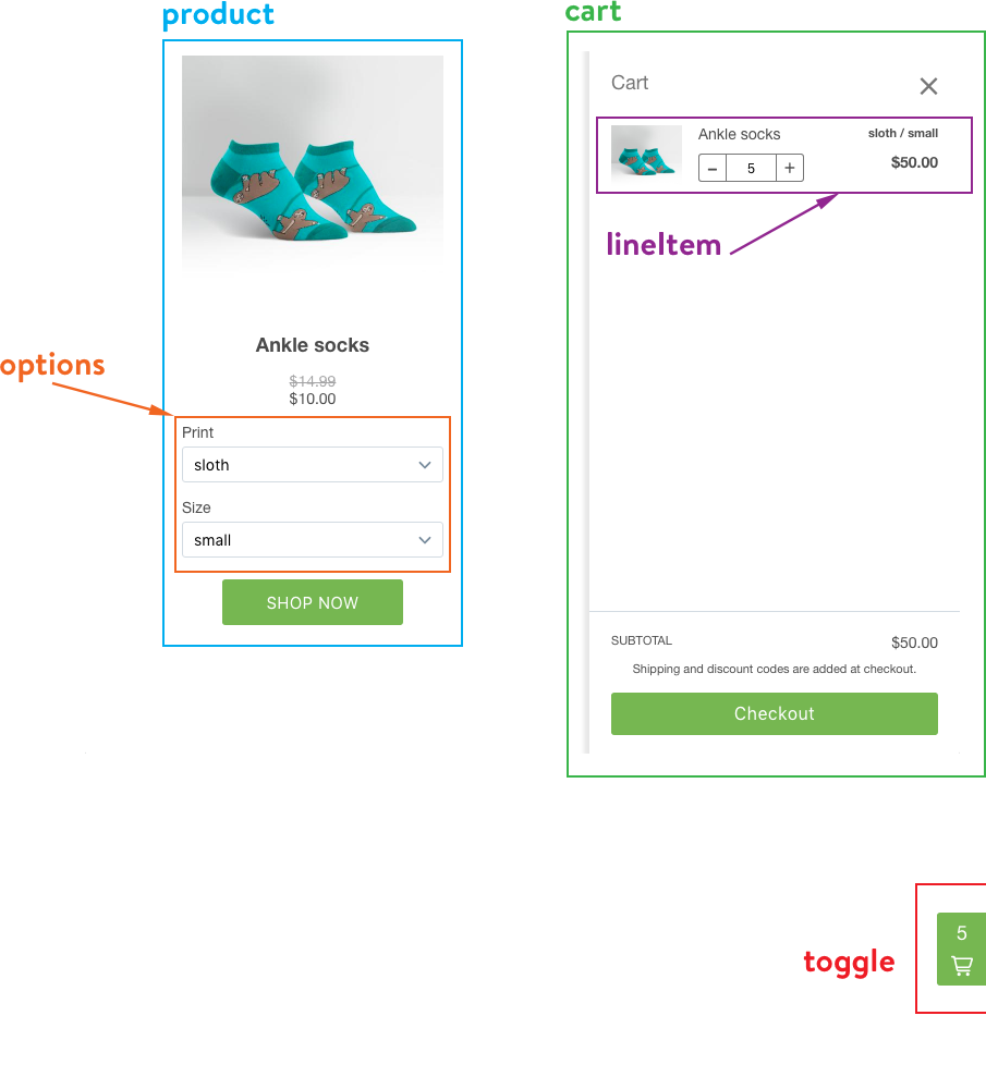
Product
Main product embed. Displays information about your product and an “Add to cart” button. Creates options component. Depending on configuration, may create a modal and cart component.
Product Attributes
buttonDestination
- ‘cart’ Adds product to cart and opens cart
- ‘modal’ Opens a modal window with further details about the product
- ‘checkout’ Opens a pop-up window directly to checkout
- ‘onlineStore’ Open product in your online store (Note: requires Online Store channel be active and product be visible in Online Store)
Type: String: 'cart', 'modal', 'checkout', 'onlineStore'
Default value: 'cart'
layout
Whether to orient the product vertically (with image on top) or horizontally (with image to the side). Vertically oriented products will have a set width (defaults to 240px) configurable by the width property, and horizontally oriented products will take up the full width of their location on your website.
Type: String: 'vertical', 'horizontal'
Default value: 'vertical'
width
Sets the maximum width for a product embed with vertical layout. Specified in pixels (ex. 400px).
Type: String
Default value: 240px
isButton
Whether or not the entire product should be clickable. Useful for if you want to hide the button and instead treat the image as a button.
Type: Boolean
Default value: false
Product contents defaults
var contents = {
  img: true,
  title: true,
  variantTitle: false,
  price: true,
  options: true,
  quantity: false, // determines whether to show any quantity inputs at all
  quantityIncrement: false, // button to increase quantity
  quantityDecrement: false, // button to decrease quantity
  quantityInput: true, // input field to directly set quantity
  button: true,
  description: false,
}
Product text defaults
Configurable text in product component:
var text = {
  button: 'SHOP NOW',
  outOfStock: 'Out of stock',
  unavailable: 'Unavailable',
}
Product events
The Product component supports the following events:
var events = {
  addVariantToCart: function (product) {},
  updateQuantity: function (product) {},
  openModal: function (product) {},
  openOnlineStore: function (product) {},
  openCheckout: function (product) {},
}
Option component
Configures the option selector contained within a product.
No configurable contents or text.
Cart
Shopping cart for product and collection embeds. Only one cart exists per page.
Attributes for cart
startOpen
Whether cart should be visible or not when initialized.
Type: Boolean
Default value: false
popup
Whether or not the checkout process is in a pop-up or the same window.
Type: Boolean
Default value: true
Cart contents defaults
var contents = {
  title: true,
  lineItems: true,
  footer: true,
  note: false,
  discounts: true,
},
Cart text defaults
var text = {
  title: 'Cart',
  empty: 'Your cart is empty.',
  button: 'Checkout',
  total: 'Total',
  currency: 'CAD',
  notice: 'Shipping and discount codes are added at checkout.',
  noteDescription: 'Special instructions for seller',
},
Cart events
The Cart component supports the following events:
var events = {
  openCheckout: function (cart) {},
  updateItemQuantity: function (cart) {},
}
LineItem component
Configures line items within cart.
LineItem contents defaults
var contents = {
  image: true,
  variantTitle: true,
  title: true,
  price: false,
  priceWithDiscounts: true,
  quantity: true,
  quantityIncrement: true,
  quantityDecrement: true,
  quantityInput: true,
},
No configurable text.
ProductSet component
Either a collection embed or a set of multiple products specified by ID.
ProductSet contents defaults
var contents = {
  products: true,
  pagination: true,
}
ProductSet text defaults
var text = {
  nextPageButton: 'Next page',
},
ProductSet events
The ProductSet component supports the following events:
var events = {
  loadNextPage: function (productSet) {},
}
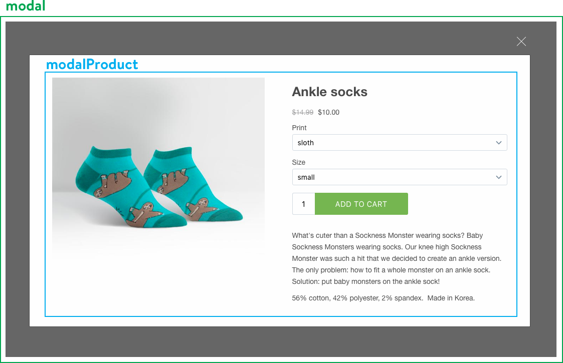
Modal component
Created when a Product’s buttonDestination property is set to 'modal'.
No configurable contents or text.
Modal events
The ProductSet component supports the following events:
var events = {
  closeModal: function (modal) {},
}
ModalProduct component
Configures the product contained within the modal. Allows product in modal to have different appearances and behaviours than the embed which launched it.
All attributes, contents, and text are as Product component.
Toggle component
Configures the small tab at the right side of the screen which opens and closes the cart. Also displays number of items contaiend in the cart. Created by Cart component.
Toggle contents defaults
var contents = {
  count: true,
  icon: true,
  title: false,
}
Toggle text defaults
var text = {
  title: 'cart', // not visible by default, but read to screen readers
},
Window component
Configures the pop-up window for checkout. You will likely only want to configure the height and width attributes.
var window = {
  height: 600,
  width: 600,
  toolbar: 0,
  scrollbars: 0,
  status: 0,
  resizable: 1,
  left: 0,
  top: 0,
  center: 0,
  createnew: 1,
  location: 0,
  menubar: 0,
  onUnload: null,
},
Advanced Attributes
Only edit the following attributes if you are knowledgeable in HTML/CSS/JavaScript and willing to dedicate the resources to maintaining a custom experience.
classes
Determines class names added to elements within components. It is unlikely you will need to edit these unless you are opting out of the iframe sandboxing.
Type: Object
Default values: dependent on component. View defaults.
templates
Determines the HTML for each element in a component. Templates are specified as strings using the Mustache templating engine, which implements the Mustache syntax.
Templates have a variety of data available to them, accessible through the data namespace. Information on the data object is a combination of the model supporting the component provided by the JS Buy SDK (ProductModel, ProductVariantModel, Option, and CartModel), the classes object, the text object, and a number of utility strings and booleans.
Make a point of duplicating the classes from the original templates, as these are used for data binding.
If you wish to add custom styles to any new HTML you add, you can add additional keys to the classes object, and then add the same key to the styles object. Ensure that you match the key for this class name between the template, the classes object, and the styles object.
Example
If you wanted to change the product title template to include extra HTML (for example, the string ‘NEW’), you could pass in a new value for the title template:
var product = {
  templates: {
    title: '<h1 class=""> <span class="">NEW</span></h1>',
  },
  classes: {
    newBadge: 'badge--new'
  },
  styles: {
    newBadge: {
      'background-color': 'red',
      'border-radius': '10px',
      'color': 'yellow'
    }
  }
}
DOMEvents
Binds custom events to DOM nodes by selector. Format is 'eventName selector': callback.
Example:
var product = {
  DOMEvents: {
    'click .button': function (event) {
      myAnalyticsLibrary.track()
    }
  }
}
DOM nodes are selected using querySelectorAll, so a valid selector must be provided. If you are binding to a class from the classes object (as is recommended), the string may contain spaces and will not start with a dot, so you will need to format it appropriately:
var DOMEVents = {
  [`click .${this.classes.product.button.split(' ').join('.')}`]: myCallback
}