
Polaris React is in maintenance mode. These archived docs cover the @shopify/polaris React library. New Shopify admin development should use Polaris web components.

Go to Polaris web components
Skip to contentShopify logoPolaris React
  • Getting started
  • Foundations
  • Design
  • Content
  • Patterns
  • Components
    • Actions
      • Account connection
      • Button
      • Button group
    • Layout and structure
      • Bleed
      • Block stack
      • Box
      • Callout card
      • Card
      • Divider
      • Empty state
      • Form layout
      • Grid
      • Inline grid
      • Inline stack
      • Layout
      • Media card
      • Page
    • Selection and input
      • Autocomplete
      • Checkbox
      • Choice list
      • Color picker
      • Combobox
      • Date picker
      • Drop zone
      • Filters
      • Form
      • Index filters
      • Inline error
      • Radio button
      • Range slider
      • Select
      • Tag
      • Text field
    • Images and icons
      • Avatar
      • Icon
      • Keyboard key
      • Thumbnail
      • Video thumbnail
    • Feedback indicators
      • Badge
      • Banner
      • Exception list
      • Progress bar
      • Skeleton body text
      • Skeleton display text
      • Skeleton page
      • Skeleton tabs
      • Skeleton thumbnail
      • Spinner
    • Typography
      • Text
    • Tables
      • Data table
      • Index table
    • Lists
      • Action list
      • Description list
      • List
      • Listbox
      • Option list
      • Resource item
      • Resource list
    • Navigation
      • Footer help
      • Link
      • Pagination
      • Tabs
    • Overlays
      • Popover
      • Tooltip
    • Utilities
      • App provider
      • Collapsible
      • Scrollable
    • Internal (shopifolk only)
    • Deprecated
      • Caption
        Deprecated
      • Contextual save bar
        Deprecated
      • Display text
        Deprecated
      • Frame
        Deprecated
      • Fullscreen bar
        Deprecated
      • Heading
        Deprecated
      • Legacy card
        Deprecated
      • Legacy filters
        Deprecated
      • Legacy stack
        Deprecated
      • Legacy tabs
        Deprecated
      • Loading
        Deprecated
      • Modal
        Deprecated
      • Navigation
        Deprecated
      • Page actions
        Deprecated
      • Setting toggle
        Deprecated
      • Sheet
        Deprecated
      • Subheading
        Deprecated
      • Text container
        Deprecated
      • Text style
        Deprecated
      • Toast
        Deprecated
      • Top bar
        Deprecated
      • Visually hidden
        Deprecated
  • Tokens
  • Icons
  • Contributing
  • Tools
  • Version guides
  • Previous releases
  • Home
  • Components
  • Images and icons

Images and icons

Represent visual content, such as avatars and thumbnails for images or video.
  • Avatar

    Avatar

    Used to show a thumbnail representation of an individual or business in the interface.
  • Icon

    Icon

    Used to visually communicate core parts of the product and available actions, acting as wayfinding tools.
  • Keyboard key

    Keyboard key

    Used to educate merchants about keyboard shortcuts.
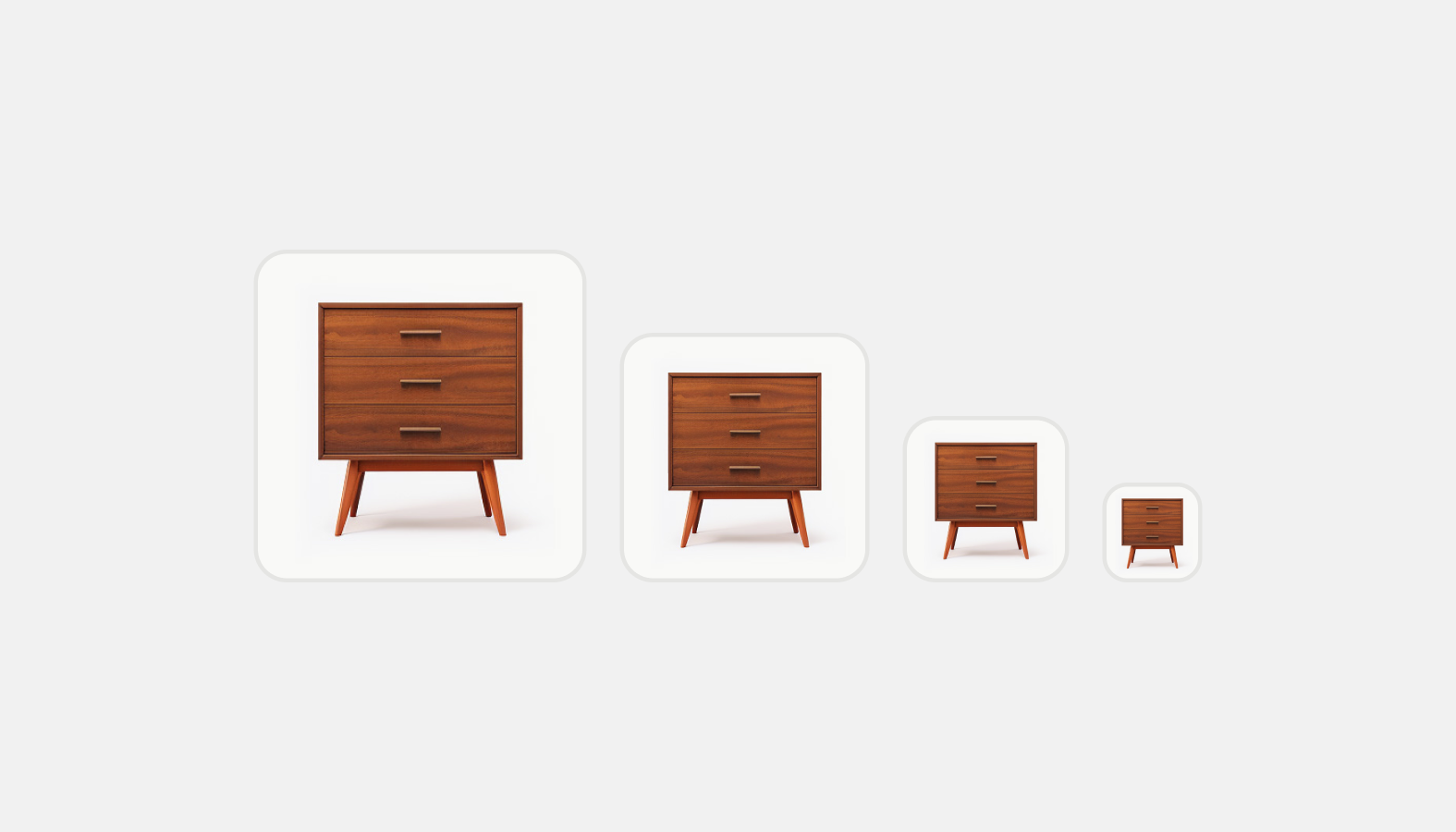
  • Thumbnail

    Thumbnail

    Used as a visual anchor and identifier for an object, along with text to provide context.

  • Video thumbnail

    Video thumbnail

    A clickable placeholder image that opens a video player within a modal or full screen when clicked.

Edit this pageLeave feedbackCreate an issue