Shadows
The DropShadow image filter is equivalent to its SVG counterpart.
It creates a filter that draws a drop shadow under the input content.
A shadowOnly property renders the drop shadow, excluding the input content.
It can also render an inner shadow via the inner property.
If you want to render inner shadows to a rounded rectangle, box shadows are much faster.
| Name | Type | Description |
|---|---|---|
| dx | number | The X offset of the shadow. |
| dy | number | The Y offset of the shadow. |
| blur | number | The blur radius for the shadow |
| color | Color | The color of the drop shadow |
| inner? | boolean | Shadows are drawn within the input content |
| shadowOnly? | boolean | If true, the result does not include the input content |
| children? | ImageFilter | Optional image filter to be applied first |
Drop Shadow
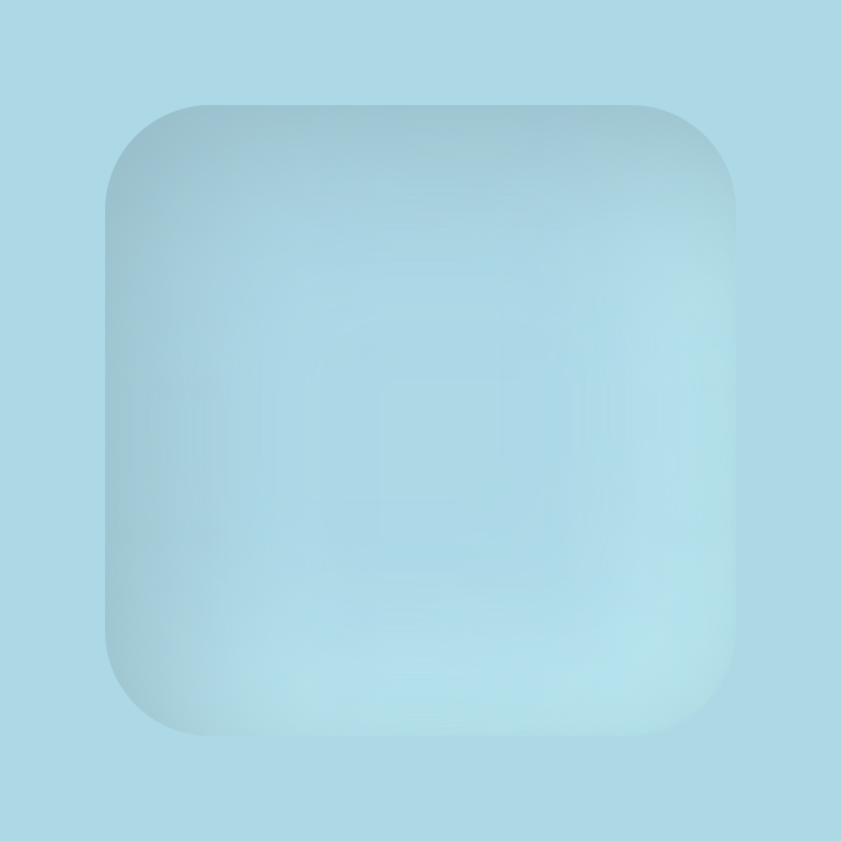
The example below creates two drop shadows. It is equivalent to the following CSS notation.
.paint {
  filter: drop-shadow(12px 12px 25px #93b8c4) drop-shadow(-12px -12px 25px #c7f8ff);
}
import {
  Shadow,
  Fill,
  RoundedRect,
  Canvas
} from "@shopify/react-native-skia";

const Neumorphism = () => {
  return (
    <Canvas style={{ width: 256, height: 256 }}>
      <Fill color="lightblue" />
      <RoundedRect x={32} y={32} width={192} height={192} r={32} color="lightblue">
        <Shadow dx={12} dy={12} blur={25} color="#93b8c4" />
        <Shadow dx={-12} dy={-12} blur={25} color="#c7f8ff" />
      </RoundedRect>
    </Canvas>
  );
};
Result
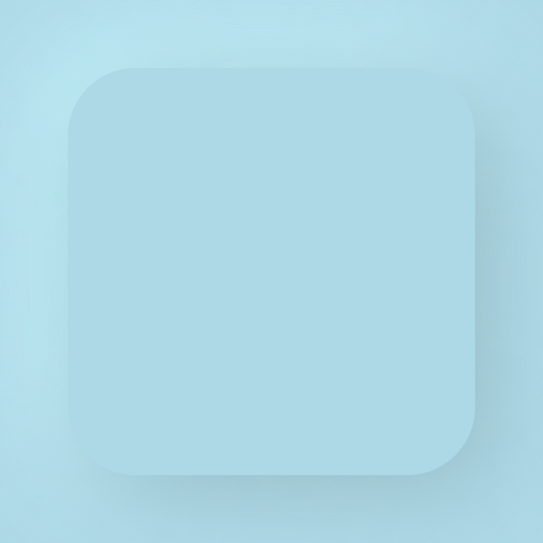
Inner Shadow
import {
  Shadow,
  Fill,
  RoundedRect,
  Canvas
} from "@shopify/react-native-skia";

const Neumorphism = () => {
  return (
    <Canvas style={{ width: 256, height: 256 }}>
      <Fill color="lightblue" />
      <RoundedRect x={32} y={32} width={192} height={192} r={32} color="lightblue">
        <Shadow dx={12} dy={12} blur={25} color="#93b8c4" inner />
        <Shadow dx={-12} dy={-12} blur={25} color="#c7f8ff" inner />
      </RoundedRect>
    </Canvas>
  );
};
Result